A Simple Guide to Moving Data into R
As developers, it’s important to understand what is going on in the software we implement, whether we are designing a new algorithm, or looking at how an existing implementation is interacting with a particular data set (or even gain insights into the data set itself). R is something that I use a fair bit these days for generating easy visualizations, especially when I’m looking at say, how to build a compression algorithm. I’ve been using it for around 3 years now, with good results. It’s also good for more advanced analysis, data processing and building content for presentations or the web.
R has quite strong builtin capabilities, as well as a massive library of plugin packages. You can do visualizations from simple plots to interactive 3D (that can be exported to render on a web page in Web GL, via the rgl package). There are also functions for massaging data, full blown statistical analysis and machine learning. Microsoft has just released a free Visual Studio integration and is strongly pushing R support into it’s product range, but R has a strong open ecosystem, is available on every common desktop OS and it is usable via a number of GUI tools, IDEs and the command line.
I’m not going to teach you how to use the language as much as show the way I use it in combination with software I’m actually developing. The language is pretty easy to pick up (and you don’t really need to learn that much, there are ready-to-copy of cookbooks that will get you most of the way there).
How I Use R
The typical way I use R is short scripts that take an output file, generate a visualization to a file, then open that file for viewing (R has built in display capabilities, but there are some limitations when running scripts outside of the GUI/IDE environments). It is possible to automate running the script (there is a command line utility called RScript that you can launch from your own code and it also allows command line parameters to be passed to the script) and it’s even possible to write scripts that take piped data (either from stdin or opening a local pipe).
One of the biggest reasons I use R is because getting data in (and out) is very simple. In fact, if you come from a C/C++ background, where even the simplest data parsing is a detail ridden chore, the simplicity with which R lets you import data to work with straight away can be empowering. R also has built in help, so if you get stuck, you can look at the help for any function in the REPL simply by prefixing it with a question mark.
The way I usually get data into R is loading a delimited file (comma, tab and custom delimited are all supported) into a data frame object. Data frames are essentially tables, they have rows and columns, where each row and column has a name (although, typically the names for the rows are ascending integers). One of the great things about doing things this way is that R will handle all the data typing automatically, columns with real numbers will work as such, as will strings (provided you get your delimiting right!). You can then access rows and columns either by name or by index ordinal (there is also slicing), or individual cells.
Quite often I’ll temporarily add a statically allocated array to code to generate a histogram following what a particular algorithm is doing in code, then flush/dump it out to a file when I’ve collected the data. At other times it’s possible to just append to the file every time you want to put out a data point, as a kind of event logging (you generally only need to write a single line).
Example
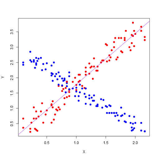
Here’s a very simple example. Firstly, here is a C program that generates 2 points using two jittered linear functions (we re-use the X component, but we’re generating two separate Ys) and outputs them as simple tab separated data with column headings in the first row. Each linear function has a matching color (red or blue).
#include <stdlib.h>
#include <stdio.h>

int main()
{
    printf( "X\tY\tColor\n" );

    for ( int where = 0; where < 100; ++where )
    {
        double x = ( where + ( rand() % 15 ) ) / 50.0;
        double y1 = ( where + ( rand() % 20 ) ) / 30.0;
        double y2 = ( ( 100 - where ) + ( rand() % 20 ) ) / 40.0;

        printf( "%G\t%G\tred\n", x, y1 );
        printf( "%G\t%G\tblue\n", x, y2 );
    }

    return 0;
}
We then pipe the standard output of this into a file (let’s call it “data.txt”). What does the R Script look like to turn this data into a scatter plot?
dataTable <- read.table("data.txt", header=TRUE)

png("data.png", width = 512, height = 512, type = c("cairo"), antialias=c("gray"))

plot(x = dataTable$X,
     y = dataTable$Y,
     pch = 19,
     xlab = "X",
     ylab = "Y",
     col = as.character(dataTable$Color))

justRed <- subset(dataTable, Color == "red")

abline(lm(formula=justRed$Y ~ justRed$X), col="purple")

dev.off()

browseURL("data.png", browser=NULL)
Here’s what we’re doing:
-
Use the read.table function to read the data.txt into a data frame. We’re using the first row of the data as column headers to name the columns in the data frame. Note, there are also CSV and Excel loads you can do here, or you can use a custom separator. The read.table uses any white space as a separator by default.
-
Create a device that will render to a PNG file, with a width of 512, height of 512, using Cairo for rendering and a quite simple antialiasing (this makes for prettier graphs than using native rendering). Note, you can display these directly in the R GUI; the Visual Studio integration actually shows the graph in a pane inside Visual Studio.
-
Draw a scatter plot. We’ve used the “X” and “Y” columns from our loaded data frame, as well as the colors we provided for the individual points. We’ve also set the shape of the plot points (with pch=19). Note, you can also access columns by position and use the column names as graph labels.
-
After that, we’ve selected the subset of our data where the Color column is “red” into the data frame and drawn a line using a linear regression model (with the simple formula of the Y mapping to X).
-
Switch off the device, which will flush the file out.
-
Open up the file with the associated viewer (this might only work on Windows and is an optional step).
Here’s the resulting image:
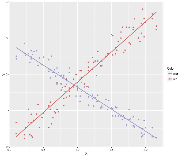
Note, this is the most basic plotting. There are many plotting libraries that produce better images, for example, here is ggplot2 using the following code (note, you’ll need to make sure you have ggplot2 package installed before you can do this):
library(ggplot2)

dataTable <- read.table("data.txt", header=TRUE)

png("data.png", width = 600, height = 512, type = c("cairo"), antialias=c("gray"))

plotOut <- ggplot(dataTable, aes(x = X, y = Y, colour = Color)) +
           scale_colour_manual(values = c("#9999CC", "#CC6666")) +
           geom_point() +
           geom_smooth(method = "lm", fill = NA)

print(plotOut)

dev.off()

browseURL("data.png", browser=NULL)
Here’s the ggplot2 image:
Note, a neat trick if you’re using Visual Studio, the debugging watch panes will actually allow you to paste multi-row data (like array contents) directly into an Excel spreadsheet, Google Sheets, or even notepad (which will give you tab delimited output), so you can quite easily grab data directly from the debugger and then run an R Script to generate a visualization.
There is a More Power Available
These are very simple ways to use R to get data out of your application. Note, the way the data goes in is quite simple, but the visualization samples I’ve provided don’t really do the power of R justice. For example, Shiny allows you to build fully interactive visualization web applications. Here’s an app that lets you graph 3D functions.
Finally, here’s a video showing a very cool animated R visualization, which I recommend watching in HD:
blog comments powered by Disqus